Aquarium Landing page (case study)
Project Overview
Goal
Design an engaging, infor mative, and visually immersive website for a fictional aquarium center,
aimed at attracting more visitors, showcasing upcoming events, and providing essential visitor
information.
Role
UI/UX Designer — responsible for user research, wireframing, prototyping, and high-fidelity UI design.
Tools Used
Figma.
Objective
Create a modern, accessible, and visually engaging website
that communicates the wonder of marine life and encourages users to visit or book tickets.
The primary goals were to:
- Increase ticket conversions
- Communicate mission-driven values (education, conservation, exploration)
- Improve access to event and exhibit information
User flow
- Homepage - Stunning hero image, brand message, and ticket CTA
- About Page - Outlines mission and educational impact
- Events Page - Upcoming events with descriptions and schedules
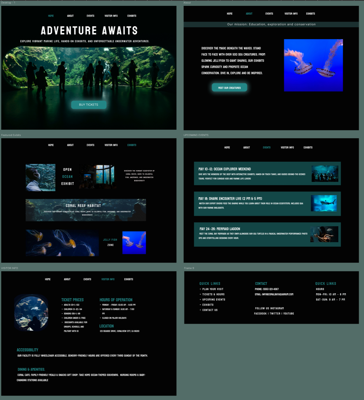
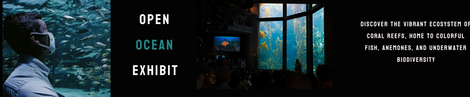
- Exhibits Page - High-impact visuals and informative exhibit sections
- Footer - Quick links, contact, and social media
Design Decisions
Dark UI with glowing aqua accents evokes an underwater atmosphere
Photography-led design builds emotional connection and excitement
High contrast CTAs stand out and encourage clicks without distraction
Outcome
5 fully designed pages with structured layout and consistent design system
Mobile-first considerations in spacing, text sizing, and navigation
ntuitive structure that encourages exploration, discovery, and engagement
What I Learned
This project challenged me to think about storytelling through layout. I focused heavily on information
architecture and the emotional impact of visuals.
It helped me further develop skills in content prioritization and building trust through design clarity.